A distribution drawing is an easy way to perceive the shape of curve and understand the characteristic of your data in visualization. Knowing the mean of asset returns and the standard deviation is vital for trading analysis. The visualization and statistics tell us if the distribution of returns follows the normal distribution or not, what the characteristics are about the curve for returns. You may know already how the normal distribution is useful to get insight about the probable prices of return over certain period of time. In the financial market, the periodic (daily, monthly, annual, etc) returns of assets like stocks and bonds are assumed to follow a normal distribution. It’s said that many other real world phenomena conform to the normal distribution too. In this article I’d like to introduce how to get a distribution from the periodic returns of the portfolio with financial data and how to run a probability plot whether a given distribution is normally distributed or not.
To obtain return data of your portfolio please refer to the previous writing. In this blog it’s explained to retrieve stock data in Pandas Datareader (All codes are there) and how to compute daily returns and cumulative returns over the certain period of time such as daily, weekly, monthly and yearly.
How to get cumulative return for your asset and portfolio in Python
I will cover 2 x how-to in the following sections.
- How to get returns and draw a distribution of returns
- How to draw a probability plot and 45 degree line to assess the distribution
How to get returns and draw a distribution of returns
Assume we’ve got asset closing price data or simply OHLC data in Pandas DataFrame object. If you went through the previous blog you could get daily OHLCV data for the multiple stocks of America with multi-indexed DataFrame. This is to obtain Apple Inc. OHLCV data in such DataFrame.
df.loc['AAPL', :]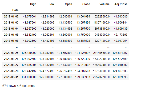
Let’s compute returns from the close prices for each row. Pandas diff or pct_change methods can be used. diff computes a difference of DataFrame elements with specific periods in float. pct_change computes percent change from the previous element in default on the other hand.
In this sample I used pct_change to compute the price percent change and have added Return column in the existing DataFrame as below.
aapl = df.loc['AAPL', :]
aapl['Return'] = aapl['Close'].pct_change().fillna(method='bfill')
aapl.tail()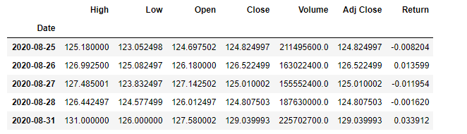
Sweet. The hist is built-in function in Pandas we can use directly on the instance to draw a histogram.
%matplotlib inline
fig = plt.figure(figsize=(15, 7))
ax1 = fig.add_subplot(1, 1, 1)
aapl['Return'].hist(bins=50, ax=ax1)
ax1.set_xlabel('Return')
ax1.set_ylabel('Sample')
ax1.set_title('Return distribution')
plt.show()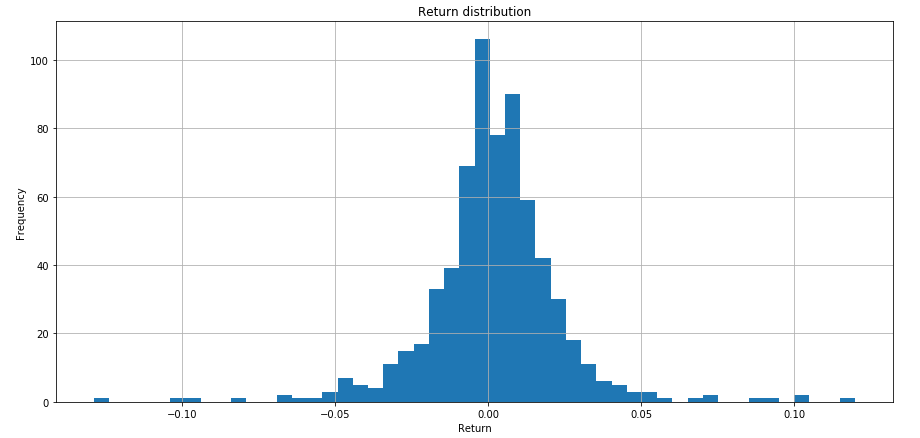
This stock data consists of 671 daily data points (671 rows in DataFrame). The observed returns are quite low (around 0.1% a day) and the standard deviation is 2% of the price. To generate some statistics you can use describe function. The statistics include those that summarize the central tendency, dispersion and shape of a dataset’s distribution, etc.
df.describe()Here’s a question. Does that return distribution curve follow the normal distribution? It looks a little skinnier than the normal distribution bell curve. Some rules can apply for analyzing the returns if this distribution conforms to a normal distribution.
How to draw a probability plot and 45 degree line to assess the distribution
A question was like if the given curve follows the normal distribution or not. If the curve conformes to the normal distribution it allows us to make useful inferences about returns. For example, all returns between -1.96 and +1.96 standard deviations of the mean fall 95% zone of all the time. When you consider far points to make your trades successful, you would know how rarely that opportunity could happen from the normal distribution nature perspective. If you aim 5% frequencies that events could happen 18 times (18 days) in a year. You can rarely trade for returns beyond 2 sigma (2 standard deviations from the mean). Let’s think about a visualization of the distribution in probability plot in this section.
Your trading strategy would be more concrete if you know the probability of your returns. Probplot is a probability plot of your data against the quantiles of a specified theoretical distribution. Probability plot must not be confused with a Q-Q plot or a P-P plot. The term probability plot sometimes refers specifically to a Q–Q plot, sometimes to a more general class of plots, and sometimes to the less commonly used a P-P plot. The formula used for the theoretical quantiles (horizontal axis of the probability plot) is Filliben’s estimate for the uniform order statistic medians.
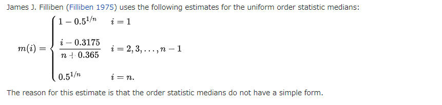
Scipy stats has the method to draw a probability plot with an option plot that gives least squares fit. Here is the pattern I generated from the past 3 years Apple Inc daily stock prices, which the shape can be seen for financial asset frequently. This figure seems not be a normal distribution but roughly it is and we might understate the likelihood of big return trades beyond -2/+2 quantiles if we ever considered data as the normal distribution. Between -1 and +1 the observed returns are concentrated densely around the mean more than the shape of true normal distribution shows. There are a lot of outeliers with high percentage returns. Please note that when our distribution is similar to a normal distribution, the points in the plot will approximately lie on the red 45% line.
import scipy.stats as stats
stats.probplot(aapl['Return'], dist='norm', plot=ax)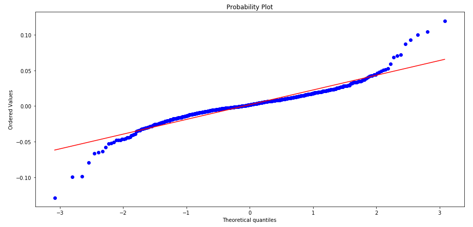
If you want to know what computations are executed behind the probability plot, this is the example in Python I played with DataFrame of Apple Inc stock data. I think this is what probplot does for scatter plot in quantiles.
I uploaded the Jupyter notebook for this experiment in github as below. All codes related to this article were run in this notebook.
How to get a distribution of returns and draw a prob plot for the distribution in Python