A trendline is a line drawn over pivot highs or under pivot lows to show the prevailing direction of price.
A trend line is one of important tools for technical traders. Trandline’s vidualization is recognizable for traders to know a direction of trend and patterns of price bounces. During the analyzed timeframe, analysts take at least 2 points in a chart to connect those points to draw a straight line.
When you take lower points in a trend, a trend like acts like a support line while taken higher points can act like a resistence line in a trend. So it can be employed to know these 2 points in a chart.
- To judge price rebounce
- To preceive a price pivot
Let’s assume we have 2 lower price points in a chart and draw a trend line. When the current price hits this uptrend line, the price curve might be rebounced within the trend. Or if the price breaks under the uptrend line drawn with the lower points, it can be thought of as a price pivot to bearlish.
Now if we have 2 higher price points in a chart and we draw a trend line by connecting 2 points. When the current price hits the downtrend line, the price curve might be rebounced within the trend. Or if the breaks above the downtrend line drawn with the higher points, it can be thought of as a price pivot to bullish.
To compute technical indicators in Python, we have Ta-lib and pyti libraries but a trend line and support/resistence lines are not included to calculate in those libraries. In this article, I’d like to show how to write trend lines from DataFrame object in matplotlib, Python.
To obtain return data of your portfolio or securities please refer to the previous writing. In this blog it’s explained to retrieve stock data in Pandas Datareader (All codes are there) and how to compute daily returns and cumulative returns over a certain period of time such as daily, weekly, monthly and yearly.
How to get cumulative return for your asset and portfolio in Python
Simple linear regression
As mentioned, the basic drawing of trendlines is to connect at least 2 points in a chart. Let’s deem this problem as a simple linear regression, then we can use scipy.stats.linregress method that calculates a linear least-squares regression for two sets of measurements. Let’s take a look at the sample.
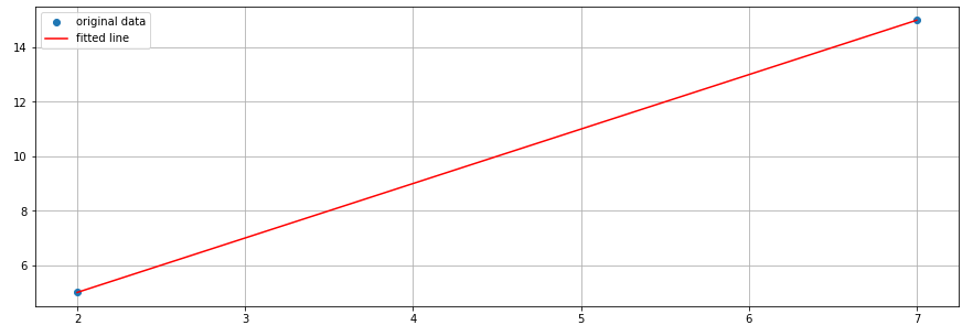
We have 2 blue points (2, 5) and (7, 15) in this euclidean plane. scipy.stats.linregress can fit a straight line computed from these points (the red line in this graph). The method returns a slope, interception, p&r values also standard errors.
Here’s the code how to draw this graph and the regression line. Let’s use a similar code for drawing trend lines in the following section.
Draw a trend line with DataFrame
The process of drawing trend lines (uptrend & downtrend) requires a few steps as below.
- Add 1 column for row numbering purpose for computation
- Compute at least 2 higher and lower data points in DataFrame
- Calculate a linear least-squares regression for trendlines
- Draw a close line and 2 trendlines by using matplotlib
Firstly I needed to add numbers for each row because this DataFrame index’s type is datetime so the type is not appropriate for a calculation of scipy.stats.linregress. I’ve added a column ‘Number’ and gave numeric values from 1 as below.
df['Number'] = np.arange(df_len)+1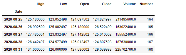
Here are the code snippet how to pick up 2 higher and lower data points from DataFrame. The computation returned only 2 sets of DataFrame rows where the data points broke above or below the calculated linear regression line in either case.
We have 2 higher and lower data points calculated, let’s take those 2 points in both uptrend and downtrend calculation for scipy.stats.linregress method. As mentioned, the method returns a slope, interception, p&r values also standard errors of a function. Sweet.
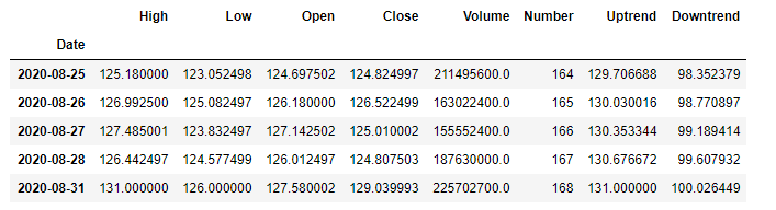
At last, we can use line plot of matplotlib with the 3 columns. 1 is the Close data to draw the closing price in green. The rest 2 of 3 are Uptrend and Downtrend that were calculated from scipy.stats.linregress to fit a straight line between 2 higher points or 2 lower points.
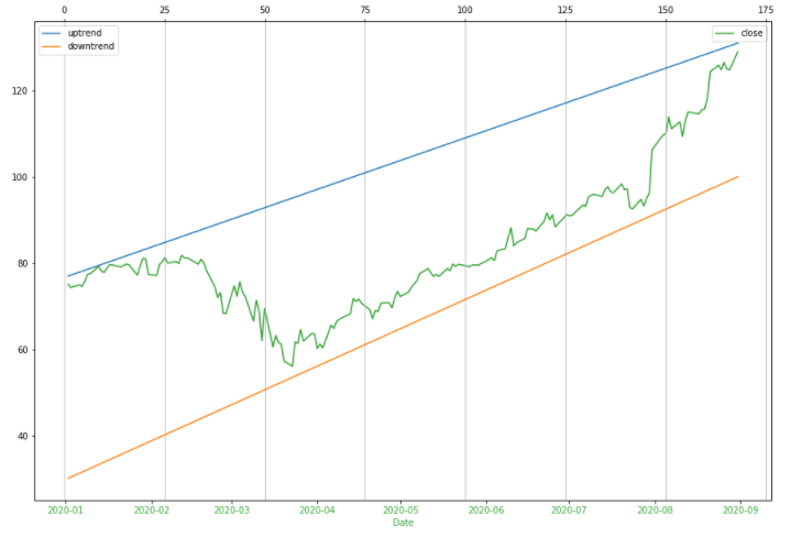
Actually this example doesn’t so look good so you can apply the same method for other assets or different time scales and timeframes.
Here’s the Jupyter notebook of all samples in github for your reference.