OHLCV is used to evaluate and analyze security or asset prices and market for a certain period of time. With its characteristic, OHLCV data can be a source data of a OHLC Bar chart or a candlestick chart. As a candlestick chart is widely used, I’ll be explaining how to draw a candlestick from DataFrame object in Python. We’ve got 3 choices which library we use, mplfinance, plotly or bokeh.
First of all, it’s nice if you understand the difference between a OHLC bar chart and a candlestick chart. Here’s good reference for you.
Candlestick chart or bar chart? Which OHLC chart should you use?
What is OHLCV?
OHLCV stands for Open, High, Low, Close and Volume (Volume is optional). Now you can understand this format data consists of values of Open, High, Low, Close and Volume of your asset. What are Open, High, Low, Close? Long story to short, OHLCV format is a series of 5 data points of the opening price, the highest price, the lowest price, the closing price, the trading volume within a particular interval such as 1 hour or 1 day.
In popular OHLC bar chart it appears as vertical lines over the unit of partucular time, each vertical line on the chart shows the price range (the highest and lowest prices). Tick marks project from each side of the line indicating the opening price on the left, and the closing price for that time period on the right.
Candlestick chart has a candle and a wick that represents either upper shadow or lower shadow. Bull candle is painted in green when the closing price is higher than the open price, while bear candle is red when the closing price is cheaper than the open price. Traders see the strength of market by the body of each candle, candle type if it’s bullish or bearish and the length of the wick. A candlestick chart is widely used and gains polularity, I wanted to cover a candlestick chart in this blog.
Mplfinance
mplfinance library was originally a part of matplotlib as a module matplotlib.finance however new library was developed as mpl_finance. mpl_finance is depreciated and you can install mplfinance library for the same use. mplfinance 0.12.7a0 is used in here.
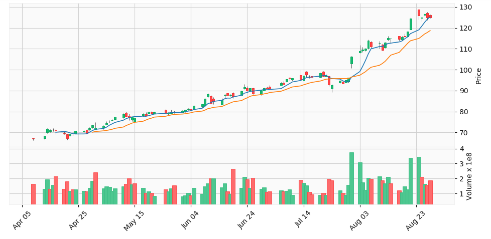
pip install mplfinanceplot function with the option type ‘candle’ gives a candlestick chart as below. The data is Apple Inc stock price in 2020. This is simpler and a neat drawing will be returned.
import mplfinance as mpf
mpf.plot(df, type='candle')
Let’s give 3 options volume, style and figratio. These 3 options can be used to adjust look of visualization. If you set volume = True, it will simply give Volume section underneath the main graph.
figratio is like a proxy of figsize of matplotlib. This sample uses figratio=(15, 7) to show the entire graph. Finally style is interesting. You can change a visual style of the graph. yahoo is applied in this case.
mpf.plot(df[-100:-1], type='candle', volume=True, figratio=(15, 7), style='yahoo', title='Apple, 2020')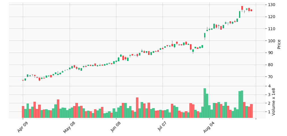
1 nice feature of mplfinance is an option mav to display a moving average line on a graph. You don’t need to override a line plot on the existing graph. Here’s an example with the moving avarage 6 days (6 data points) and 15 days (15 data points) in DataFrame.
mpf.plot(df[-100:-1], type='candle', volume=True, figratio=(15, 7), style='yahoo', mav=(6, 15), title='Apple, 2020')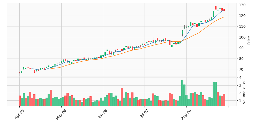
Attention, no gaps between candles and bars are seen because it’s smoothed. If you want to see gaps for data points when there were no trades you can give the option show_nontrading=True. Here’s the example with the same data set.
Notice, in the above chart, there are no gaps along the x-coordinate, even though there are days on which there was no trading.
- Easy integration for Moving Average (Simple Moving Average)
- Easy style change
- Lightweight with some additional features (animation, etc)
Plotly
Plotly is an open-source library to create an interactive plots for statistical, financial, geographic, scientific, and 3-dimensional use-cases. Financial charts supports a candlestick chart in the library. Here’s the official site for candlestick drawing. This section follows this reference mostly. plotly 4.10.0 is the version I tested.
pip install plotly==4.10.0You can call Candlestick method in plotly.graph_objects and call Figure method to visualize the Candlestick. It comes with range slider for the x-axis data.
import plotly.graph_objects as go

candlestick = go.Candlestick(
    x=df.index,
    open=df['Open'],
    high=df['High'],
    low=df['Low'],
    close=df['Close']
)

fig = go.Figure(data=[candlestick])
fig.show()
If you prefer not to have the x-axis range slider, here is the code.
fig.update_layout(xaxis_rangeslider_visible=False)
fig.show()
In default a graph is not decorated with any information such as title, annotation, and text. It’s neat there. We can call update_layout method of Figure object that we created and add attributes in the object to add title, annotations and so on.
fig.update_layout(
    title='Apple Inc stock price',
    yaxis_title='Stock price',
    shapes = [dict(
        x0='2020-03-22', x1='2020-03-22', y0=0, y1=1, xref='x', yref='paper',
        line_width=3)],
    annotations=[dict(
        x='2020-03-27', y=0.05, xref='x', yref='paper',
        showarrow=False, xanchor='left', text='COVID19')]
)
fig.show()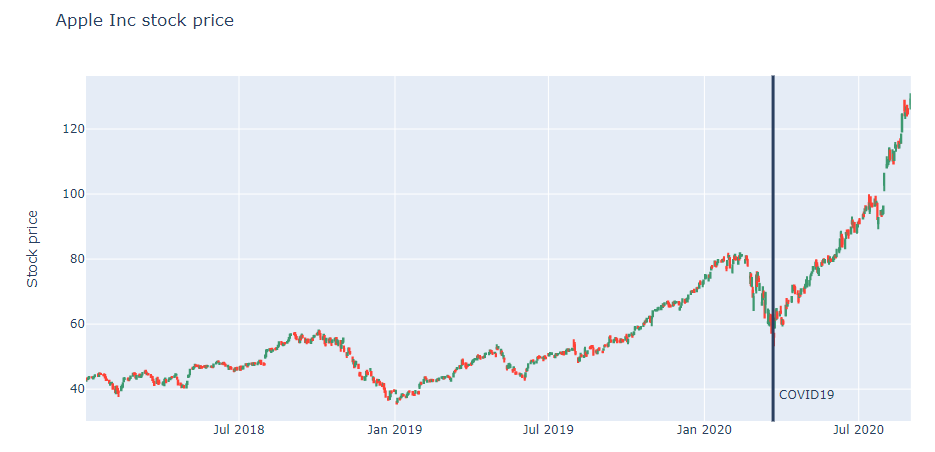
- Easy to generate an interactive drawing with range slider
- Need a little learning cost for how to use plotly library itself
- Rich features and customizations available on the official site
Bokeh
Bokeh is an interactive visualization library for modern web browsers. The internal application of Bokeh is having built-in widgets and is capable for adding tools easily on browser. In default there are widgets such as Pan, Box zoom, Wheel zoom, etc appearing at the right side of image. I used bokeh version 2.0.1 for this testing.
pip install bokehWe use bokeh.plotting.Figure class to craete bars (bull and bear bodies) with vbar method and wicks with segment method. There is no 1 line function to draw a candlestick chart in Bokeh from DataFrame object, but the powerful and flexible interactions in bokeh definately pay once you create a graph.

- Easy to generate an interactive drawing with default side menu
- Need a little learning cost for how to use Bokeh library itself
- Amazing customization about widgets and tools that we can add
I showed tutorials in this article but I found some advanced repositories and notebooks in github. You may find the one that is suitable for your case.
To wrap up, I recommend using mplfinance library if you’d like to create a static image and save it or use it for document or reference use. Because it takes DataFrame directly and easy to understand intuitively. It also supports simple moving average with just 1 option.
If you want develop an application on Jupyter or need an interactive control, then I recommend using Bokeh with adding your own widgets and tools especially on Jupyter notebook. In case if you have periodic data from database or API, the Bokeh would be helpful for your analysis.
Here’s the Jupyter notebook of all samples in github for your reference.
How to draw a candle stick chart with DataFrame in Python (mplfinance, plotly and bokeh)