Trend trading is one of the major trading methods for securities and assets in the markets. It is based on an analysis of a particular direction of asset momentum. In Investopia article below, 4 trend most common indicators were introduced for strategies, those are must to know. There is no single indicator we can look into to make profitable trades however a combination of trend indicators might be a good tool to decrease the likelihood of misjudgement of trends. Let’s grasp 4 trend indicators and how to draw those lines and bars from DataFrame object in Python matplotlib. In the previous article, I introduced how to obtain DataFrame OHLCV data via API or Pandas Datareader, I used OHLCV data of DataFrame for this writing in the same way.
Besides these 4 common used trend indicators, support line and resistence line are crucial to consider entry timings to some degree. I do not cover support line and resistence line in this article but will cover soon.
Trend Trading: The 4 Most Common Indicators
- Moving Averages
- Moving Average Convergence Divergence (MACD)
- Relative Strength Index (RSI)
- On-Balance Volume (OBV)
Moving Averages
Moving Average is a rolling mean of certain period of time. If you set a rolling period 3 days (3 consecutive rows in DataFrame), then a calculation will be a mean value of 3 days closing prices with simple moving average calculation. There are some variations not just only simple, but cumulative, exponential, weighted, etc.
In this sample crossover shows with scatter plot when a golden cross or a dead cross appears. A red circle mark means a dead cross when the longer moving average crosses below the shorter moving average, and a blue circle mark means a golden cross when the shorter moving average crosses above the longer moving average.
I wrapped SMA in a function, it takes DataFrame object, shorter average period in integer and longer average period in integer as below.
SMA(df, 8, 15)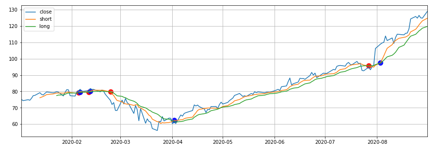
You can adjust the calculations of moving average for the variations.
Moving Average Convergence Divergence (MACD)
MACD is a kind of oscillating indicator. Oscillator looks into whether the trend is upward or downward. In MACD case, when the main line is above zero for a sustained period of time, the asset is likely trending upwards. Conversely, if the main line is below zero for a sustained period of time, then the asset is likely under downwards.
A signal line is the second line that is moving average of the main line of MACD. Crossovers with these 2 lines (the main line and the signal line) can also provide additional buy and sell signals in the same calculation of the shorter and the longer moving averages crossovers.
I wrapped MACD in a function, it takes DataFrame object, shorter average period in integer and longer average period in integer as below.
MACD(df, 12, 26, 9)
Relative Strength Index (RSI)
RSI is also an oscillating indicator. It’s calculated in numeric value ranging from 0 to 100. This number explains how relative buying strength and selling strength are. To be accurate, the number is a ratio of averages of upwards changes and downwards changes over certain period of time.
Most typically used window is 14-day, with high and low levels marked at 70 and 30, which means RSI above 70 indicates upwards while RSI below 30 indicates downwards.
I wrapped RSI in a function, it takes DataFrame object, a list of multiple RSI windows in integer as below.
RSI(df, [9, 22, 42])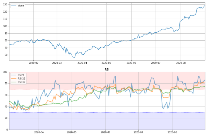
On-Balance Volume (OBV)
OBV is a unique indicator which is computed from volume data. The indicator measures cumulative volume at each data point by adding the volume on “up” days and subtracting volume on “down” days. If today’s closing price is bigger than yesterday’s closing price, today’s volume is added to OBV.
Please be careful about the starting point is zero for OBV so comparing this added value for different time data doesn’tt make any sense. The indicator confirms the trend, the price might be lagging after OBV start rising or falling.
I wrapped OBV in a function, it takes DataFrame object and shows the normal closing price in a line plot and OBV line as below.
OBV(df)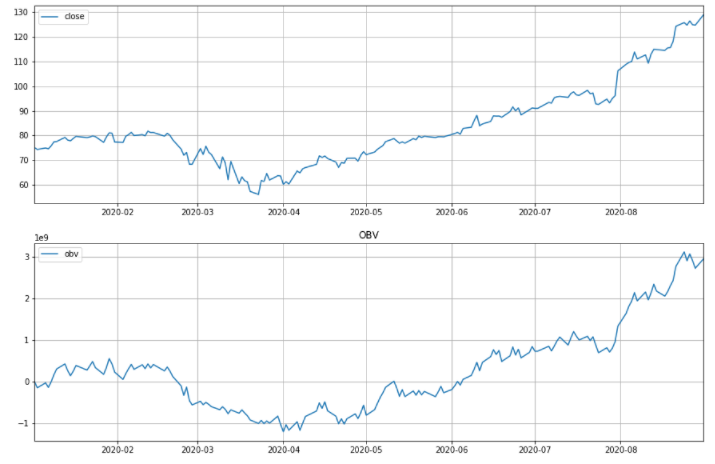
In this article, 4 most common used trend indicators were pick up. In my opinion moving average and its variations such as exponential and weighted moving averages are usable and handy. EMA is more lagging tolerable than SMA. I like it.
How to draw 4 most common trend indicators in matplotlib in Python